Tel/WhatsAapp:+86 13366396425
E-mail: chloe_xia@vleap.com.cn

Who this guide is for: brand owners, product developers, and creative directors building 2026 color stories for custom handbags who need to translate this year’s headline colors — Pantone’s Cloud Dancer (a billowy white) and WGSN/Coloro’s Transformative Teal (a blue-green fusion) — plus the supporting seasonal palette into production-ready material and finish specifications. Each color in this guide is paired with the material it works best on, the finish that activates it, the care implication the consumer must understand, and the lab-dip discipline required to achieve it at scale.

Two institutions set the annual color agenda for product development: Pantone (whose Color of the Year has been a retail and media touchstone since 1999) and WGSN/Coloro (whose Color of the Year and seasonal key colors are the B2B standard used by material suppliers, dye houses, and garment manufacturers worldwide). Their 2026 selections point in different but complementary directions — Pantone toward pure serenity (white), WGSN/Coloro toward ecological transformation (teal) — and together, with their supporting palettes, they define the color field from which brands will build their 2026 collections.
The challenge for handbag developers is that a color swatch is not a product. Cloud Dancer is stunning on a Pantone chip — but on PU leather it is a soiling liability that requires protective coating, stain-resistant finishing, and consumer education. Transformative Teal is mesmerizing on a WGSN mood board — but on light-colored leather it can shift green or blue depending on the substrate’s base tone, the dye chemistry, and the lighting. Every color in the 2026 palette has a production personality — a set of material affinities, manufacturing considerations, and consumer-care implications — that this guide documents.
Pantone’s selection of a white as the 2026 Color of the Year is unprecedented — the first white in 25+ years of annual selections. Cloud Dancer is not a stark, clinical white; it is described as a “billowy, balanced white imbued with serenity” — a soft white with warmth, positioned as a “blank canvas” and a “conscious statement of simplification.”
Why it matters for handbags: white and near-white bags are the most commercially challenging color in the category — simultaneously the most aspirational (the “clean luxury” signal) and the most risky (the soiling, yellowing, and maintenance nightmare). Cloud Dancer’s selection will generate massive consumer search demand for white bags; the brands that can produce a white bag that STAYS white will capture that demand. The brands that produce a white bag that yellows, stains, or transfers will generate the reviews that kill the listing.
| Element | Specification | Why |
|---|---|---|
| Material — first choice | Smooth or pebbled PU leather with stain-resistant topcoat | PU’s synthetic surface is the most controllable substrate for white — no hide-to-hide variation, no natural yellowing agents; the stain-resistant topcoat (a fluoropolymer or silicone-based surface treatment) repels liquid spills and surface dirt |
| Material — premium | Pigmented top-grain cowhide, white-pigmented (not aniline-dyed — pigmented white uses an opaque coating that covers the hide’s natural base color) | Genuine leather in white requires heavy pigmented finishing to mask the hide’s warm base tone; aniline white is virtually impossible on bovine leather |
| Material — avoid | Full-grain aniline or vegetable-tanned leather | The natural hide color bleeds through any white dye; the patina that develops on veg-tan darkens the surface from white to cream to amber within weeks |
| Finish | Stain-resistant topcoat mandatory; specify “hydrophobic surface treatment” on the lab-dip request; confirm with a water-drop test (the drop must bead and roll off, not absorb) | White surfaces show every mark — coffee, pen, hand cream, denim transfer; without the stain-resistant finish, the bag is a consumer-complaint generator |
| Color match discipline | ΔE ≤ 1.0 from approved lab dip — the tightest tolerance; any perceptible warm or cool drift is visible on white | White magnifies substrate variation; a ΔE of 1.5 that would be invisible on black is noticeable on white |
| UV protection | UV-stabilized material and UV-protective topcoat; specify lightfastness ISO 105-B02 rating 5 minimum | White PU and pigmented leather yellow under UV; the UV stabilizer is the primary defense against the “it turned yellow” review |
| Hardware | Silver (polished or brushed), light gold (soft, not warm), or translucent/white-coated hardware | Dark hardware (antique brass, gunmetal) creates too much visual weight against white; match the hardware to the airy, light palette |
| Lining | White or pale gray interior; avoid dark linings that could transfer dye to the light exterior through the seams | Color transfer from a dark lining through a light exterior is a real risk at pressure points (base corners, seam allowances) |
| Consumer care | Include a microfiber cleaning cloth and a care card: “Wipe with the included cloth after each use. Avoid contact with denim (dye transfer risk), newsprint, and dark surfaces. Store in the included dust bag.” | Proactive care guidance prevents the “it stained immediately” reviews |
| Denim transfer test | Before approving the PP sample, rub the white surface against dark-wash denim with moderate pressure for 10 cycles; inspect for blue transfer | Denim transfer onto white bags is the #1 real-world staining complaint; the stain-resistant finish must pass this test |
Cloud Dancer bags should be marketed as aspirational statement pieces — not everyday carry. The white bag is the “occasion” product: the brunch, the summer evening, the vacation, the editorial photograph. Setting this expectation (through product-page language and lifestyle photography) prevents the consumer from treating it as a daily workhorse and then complaining about soiling.
Product page framing: “Cloud Dancer: our softest white, inspired by the 2026 Pantone Color of the Year. Finished with a stain-resistant coating for confident carry — because a white bag should feel like freedom, not fragility.”
WGSN and Coloro’s selection sits at the opposite end of the spectrum: Transformative Teal is a deep, meditative fusion of dark blue and aquatic green — described as “mysterious and mesmerizing,” reflecting an Earth-first mindset and ecological responsibility. Coloro’s Feasibility Intelligence confirmed it is “highly achievable across all major textile substrates” with “good levels of light fastness” — a rare endorsement that means the color is production-friendly from a dyeing perspective.
Why it matters for handbags: teal is a “new neutral” — dark enough to function as an everyday alternative to black, distinctive enough to stand out in a product grid, and emotionally coded as “sustainable” and “intentional” by the cultural narrative WGSN has built around it. For brands with eco-friendly positioning, Transformative Teal is the year’s strongest color-identity opportunity.
| Element | Specification | Why |
|---|---|---|
| Material — first choice | Pebbled or smooth PU in a semi-matte finish; or nylon (solution-dyed for maximum color consistency and lightfastness) | PU provides the controlled substrate for precise teal reproduction; solution-dyed nylon has the best lightfastness of any substrate — the teal will not shift over years of use |
| Material — premium | Chrome-tanned pigmented cowhide or microfiber leather | Leather in dark teal is achievable with pigmented finishing; the depth of the color masks natural hide variation better than lighter hues |
| Material — challenging | Canvas (cotton); vegetable-tanned leather | Cotton canvas absorbs teal dye unevenly (the natural fiber structure creates subtle mottling — which may be desirable for a handcraft aesthetic or undesirable for a clean look); veg-tan’s warm base shifts teal toward green |
| Color match discipline | ΔE ≤ 1.5 from ALD; critical: evaluate under THREE illuminants (D65, 2700K, 4000K) — teal is moderately metameric; a teal that looks correct under daylight can shift blue under warm light or green under cool fluorescent | The blue-green balance IS the color; a hue shift in either direction produces a different color, not a variation of the same one |
| Finish | Semi-matte or matte — the runway and editorial presentation of Transformative Teal is non-reflective; a glossy finish lightens the perceived color and reduces the “depth” that makes teal feel contemplative | Semi-matte preserves the dark, meditative quality of the color |
| Hardware | Antique brass, brushed gold, or matte black — warm-toned hardware complements the blue-green; avoid bright polished silver (too cool; fights the teal’s warmth) | The hardware’s warmth enriches the teal; the teal + antique brass combination is the most commercially compelling pairing |
| Lining | Tonal teal (slightly lighter) or warm cream — the interior should extend the color story | A white interior creates too much contrast against the deep exterior; tonal or warm-cream softens the transition |
| Eco positioning | If the brand has sustainability credentials, teal is the Color of the Year to attach them to: “Transformative Teal: a color that reflects our commitment to an Earth-first approach” | WGSN’s narrative explicitly connects teal to ecological responsibility — the consumer pre-understands the association |
WGSN and Coloro forecast five key colors per season, two years in advance. The SS26 palette, alongside Transformative Teal, includes four additional colors — each with distinct production implications for handbags.
A vivid neon straddling pink and purple — the most challenging color in the palette from a production standpoint.
| Element | Specification |
|---|---|
| Material | PU only (for consistent reproduction) or solution-dyed nylon; genuine leather cannot reliably achieve true neon saturation without heavy topcoating that changes the leather’s hand-feel |
| Challenge | Neon pigments have notoriously poor lightfastness — a neon fuchsia that fades to dull pink in 3 months undermines the entire product; specify lightfastness rating 4 minimum (the best achievable for neons; rating 5 is unrealistic) |
| Application | Mini bags and accessories — the small surface area makes neon feel “delightful” rather than “overwhelming”; an electric fuchsia clutch or crossbody strap is a statement; an electric fuchsia tote is a costume |
| Hardware | Minimal or matching — let the color be the entire statement |
A serene blue-gray pastel — calming, minimal, and modern. Closely adjacent to the “glacier blue” / “Cool Blue” identified in our Pinterest Predicts trend guide.
| Element | Specification |
|---|---|
| Material | PU (smooth or pearlized finish) or soft microfiber — the pastel reads best on materials with a slight luminosity; matte surfaces flatten the color |
| Challenge | Pale blue-gray is substrate-sensitive — the base material’s own color influences the result; PU backing-fabric variation and hide-to-hide variation (on leather) are amplified on pastels; tighten ΔE to ≤ 1.0 |
| Application | Structured totes and crossbodies — Blue Aura reads as calm and professional; it works as an alternative neutral for the consumer who wants “not black but not colorful” |
| Hardware | Brushed silver or satin chrome — the cool-toned hardware extends the serene palette |
A rich amber yellow with heritage appeal and craft character — warm, grounded, and earthy.
| Element | Specification |
|---|---|
| Material | The most leather-friendly warm tone in the palette — amber sits naturally in the cognac/saddle family and dyes beautifully on both chrome-tanned and vegetable-tanned leather; also excellent on canvas |
| Challenge | Low — amber is a stable, well-established dye family with good lightfastness and batch consistency; the warm base of most substrates enriches rather than distorts it |
| Application | Heritage and everyday silhouettes — shoulder bags, totes, satchels; Amber Haze reads as “warm leather craft” and pairs with the Poetcore aesthetic |
| Hardware | Antique brass or raw brass — the warm-on-warm combination creates a unified heritage tone |
A playful pastel green — fresh, optimistic, and light.
| Element | Specification |
|---|---|
| Material | PU or TPU (for the “jelly” translucent interpretation that the name suggests); PU in smooth finish for opaque mint; TPU for translucent/Gimme Gummy crossover |
| Challenge | Moderate — mint green is a pale, cool-toned pastel that is substrate-sensitive (PU backing variation and leather base color both influence the result); similar production discipline as Blue Aura |
| Application | Mini bags, accessories, and summer-seasonal pieces — mint reads as “spring/summer” and is difficult to merchandise year-round; plan as a seasonal drop, not a permanent SKU |
| Hardware | Light gold or translucent/resin hardware — heavy dark hardware overwhelms the delicate hue |
WGSN/Coloro’s AW26/27 key colors extend the trend palette into the second half of the year, adding darks and neutrals that balance the SS26 brights.
A warm cream off-white — the soothing, low-contrast neutral that WGSN positions as the season’s alternative to both black and white.
| Element | Specification |
|---|---|
| Material | Excellent on every substrate — the warm cream tone aligns naturally with leather’s base color (especially veg-tan, which IS this color naturally), PU, canvas, and nylon |
| Relationship to Cloud Dancer | Cloud Dancer (Pantone) is a cooler, purer white; Wax Paper (WGSN/Coloro) is a warmer, creamier off-white — the two are companions, not competitors; brands can offer both as a “warm neutral vs. cool neutral” pairing |
| Advantage | Lower soiling risk than pure white — the warm cream tone hides minor marks and surface dust better than Cloud Dancer’s bright white |
| Application | Any silhouette; any tier — Wax Paper is the most commercially versatile neutral in the palette |
A deep chocolate brown — the dark neutral that replaces black for warmth and depth.
| Element | Specification |
|---|---|
| Material | Excellent on all substrates — dark brown is the most forgiving color to produce; substrate variation is masked; lightfastness is inherently strong |
| Application | Core neutral alongside black; particularly strong on structured silhouettes (totes, top-handles, bowling bags) where the color’s richness reads as “premium” |
| Hardware | Antique gold, polished gold, or dark gunmetal — all work; cocoa brown is the most hardware-versatile color in the palette |
| Production challenge | None — dark brown is the easiest color to produce consistently; use it as the anchor staple in your 2026 palette |
A rich, royal purple — confident and unexpected as a bag color.
| Element | Specification |
|---|---|
| Material | PU (smooth or suede-effect) or pigmented leather — purple requires precise dye formulation; the red-blue balance determines whether it reads as “regal purple” (correct) or “eggplant” (too warm) or “grape” (too blue) |
| Challenge | Moderate — the red/blue balance is sensitive; ΔE ≤ 1.5 with metamerism check under 2700K (purple shifts more than most colors under warm light) |
| Application | Statement pieces — 1–2 SKUs in the collection as the “unexpected color” option alongside neutrals; particularly strong on the ladylike top-handle and the structured crossbody |
A bright yellow-green — the highest-energy color in the AW palette.
| Element | Specification |
|---|---|
| Material | PU only — the saturation and brightness cannot be reliably achieved on natural substrates; same neon-lightfastness concerns as Electric Fuchsia |
| Application | Accent only — a strap, a lining accent, or a single mini SKU; Green Glow at full-bag scale overwhelms the design |
| Color | Source | Difficulty | Best Material | Hero Application | Lightfastness Rating Required |
|---|---|---|---|---|---|
| Cloud Dancer (white) | Pantone COTY | Very High | PU with stain-resistant topcoat | Aspirational occasion tote; mini bag | 5+ |
| Transformative Teal | WGSN/Coloro COTY | Moderate | PU; solution-dyed nylon; pigmented leather | Everyday crossbody; eco-positioned tote | 4+ |
| Electric Fuchsia | WGSN SS26 | High | PU; solution-dyed nylon | Mini crossbody; strap accent | 4 (neon maximum) |
| Blue Aura | WGSN SS26 | Moderate–High | PU (pearlized or smooth); microfiber | Structured tote; crossbody | 4+ |
| Amber Haze | WGSN SS26 | Low | Leather (any tannage); canvas; PU | Heritage shoulder bag; satchel | 4+ |
| Jelly Mint | WGSN SS26 | Moderate | PU; TPU (translucent) | Summer mini bag; accessories | 4+ |
| Wax Paper (cream) | WGSN AW26 | Low | Any — universally compatible | Core neutral; any silhouette | 4+ |
| Cocoa Powder (brown) | WGSN AW26 | Very Low | Any — the easiest color | Core dark neutral; structured bags | 4+ |
| Fresh Purple | WGSN AW26 | Moderate | PU; pigmented leather | Statement top-handle; crossbody | 4+ |
| Green Glow | WGSN AW26 | High | PU only | Accent strap; mini bag | 4 (neon maximum) |
The 2026 palette’s strength is its range — from serene whites through warm ambers to deep teals and vibrant fuchsias. A well-constructed collection uses the palette strategically, not comprehensively: no brand should offer all ten colors. Instead, build a palette of 3–5 colors per season from the trend pool, anchored by permanent neutrals.
| Slot | Color | Role | Carry-Over? |
|---|---|---|---|
| 1. Dark neutral (permanent) | Black or Cocoa Powder | The anchor; the best-seller; the color that needs no explanation | Yes — permanent |
| 2. Warm neutral (permanent) | Cognac/Amber Haze or Wax Paper | The “leather” color; the warm complement to the dark neutral | Yes — permanent or seasonal swap between cognac and cream |
| 3. Trend neutral (seasonal) | Transformative Teal or Cloud Dancer | The Color of the Year adoption; trend-driven but neutral enough for daily carry (teal) or aspirational enough for occasion carry (white) | Seasonal — evaluate sell-through before making permanent |
| 4. Statement color (seasonal) | Fresh Purple, Electric Fuchsia, or Blue Aura | The “unexpected” option; 1 SKU only; the color that makes the collection look designed, not default | Seasonal — rotate each season; this is where trend energy lives |
| 5. Accent (optional) | Jelly Mint or Green Glow | A pop color on a strap, a lining, or a single mini bag — not a full-collection colorway | Seasonal accent — the lowest inventory commitment |
| Color Difficulty | Lab-Dip Rounds Expected | Lead Time (from Pantone reference to approved lab dip) | Notes |
|---|---|---|---|
| Easy (Cocoa Powder, Amber Haze, black) | 1 round | 5–7 days | These colors are established; dye houses have refined formulations; first-round approval is common |
| Moderate (Transformative Teal, Blue Aura, Fresh Purple, Wax Paper, Jelly Mint) | 1–2 rounds | 7–14 days | Substrate-sensitive colors that require careful evaluation under multiple illuminants; a second round is common for hue-balance refinement |
| Difficult (Cloud Dancer, Electric Fuchsia, Green Glow) | 2–3 rounds | 14–21 days | White requires extreme ΔE tolerance; neons require lightfastness verification; expect iterative refinement |
Action: submit lab-dip requests for your difficult colors (Cloud Dancer, any neons) 4 weeks before your moderate colors — the additional rounds mean these colors take the longest to lock, and they become the bottleneck if left to last.

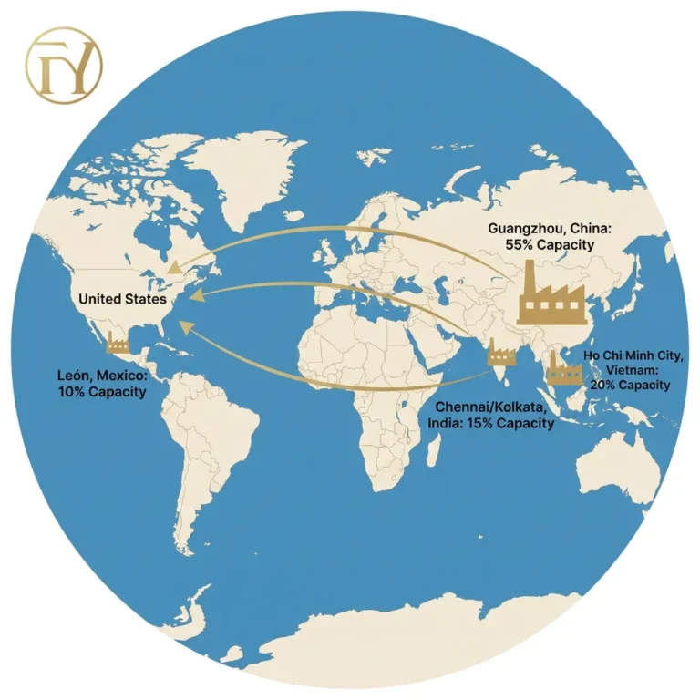
FYBagCustom is Your Trusted Custom Bag Manufacturer in China, with 15+ years of manufacturing experience and a color management system optimized for the full range of 2026 trend colors — from the production-simple (Cocoa Powder, Amber Haze) to the production-demanding (Cloud Dancer, Electric Fuchsia). For brands building 2026 color stories, our capabilities include:
Contact our color team to submit your 2026 palette references and begin the lab-dip process.
The 2026 Colors of the Year are not just mood boards — they are manufacturing specifications with distinct material requirements, finish dependencies, and risk profiles. For B2B buyers translating the 2026 palette into production orders, three core takeaways:
If you are building your 2026 color plan and need lab dips, stain-resistant white, or lightfastness-tested trend colors on your production materials, contact FYBagCustom to begin the color development process — and receive spectrophotometer-verified swatches, typically within 5–12 days.
FYBagCustom’s color lab delivers spectrophotometer-verified lab dips for Cloud Dancer white (with stain-resistant finishing), Transformative Teal, and the full WGSN/Coloro palette — on PU, leather, nylon, and canvas. Color-verified samples in 5–12 days.
Start Your Custom Bag Project →