Tel/WhatsAapp:+86 18011919834
E-mail: chloe.x@fybagcustom.com

Tel/WhatsAapp:+86 18011919834
E-mail: chloe.x@fybagcustom.com
Send Your Inquiry Today

Color Families
Exact Matching
Standard Lighting QC
Batch-to-Batch Tolerance
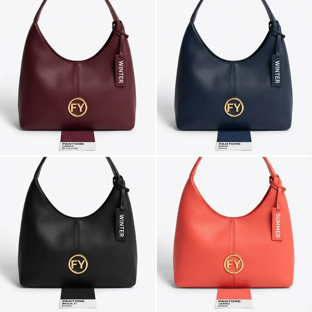
We organize bag colors into four families — each with different brand positioning, market fit, and production considerations. Click into any family for detailed color options, fabric compatibility, and application recommendations.
Black, white, grey, navy, brown, tan, beige, cream, camel, olive, khaki. The foundation of any bag line — 70%+ of commercial bag sales are neutrals. Highest reorder rate, lowest inventory risk, universal appeal across markets and seasons.
Blush, sage, lavender, powder blue, mint, peach, lilac, dusty rose, soft coral. The palette of weddings, spring collections, feminine fashion, and baby/maternity brands. Seasonal best-sellers with strong Amazon and DTC performance.
Gold, silver, rose gold, bronze, gunmetal, copper. For evening clutches, fashion handbags, holiday capsules, and premium gifts. Highest perceived value per unit. Hardware-finish coordination is critical — metallic bag + matched hardware = cohesive luxury.
Red, cobalt, emerald, fuchsia, neon, electric blue, orange, hot pink, mustard. Statement colors for festival merch, sports brands, youth lines, seasonal drops, and brand-signature positioning. Higher visual impact; plan inventory carefully — bold colors are trend-sensitive.
Color is a business decision, not just an aesthetic one. Your palette affects inventory risk, seasonal sellthrough, brand recognition, and customer perception. Walk through these three strategic choices in order.
The DNA of Your Collection
Start with 2–4 neutral colors that sell in every season and every market. These are your PERMANENT colorways — always in stock, always in the listing, never discounted. Black, navy, and grey/tan cover 70%+ of bag demand across all categories.
Black
Universal
Navy
Professional
Grey
Modern
Tan / Camel
Warm neutral
Matching Color to Use Scenarios
Add 1–2 seasonal colors that rotate every 6–12 months. These create “newness” in your listings, drive social media interest, and capture trend-conscious buyers. Pastels for spring/summer, jewel tones for fall/winter, bold for festival/holiday. Plan to sell through within one season — don’t overstock.
Core, Accent & Limited
One color that IS your brand — Tiffany blue, Hermès orange, Fjällräven ochre. If your brand has a signature Pantone, this color should appear on every product in the range, in every marketing asset, and in the packaging. We produce your signature color to exact Pantone match and lock the reference for all future orders.
Color choice depends on who the bag is for and where it will be used. A commuter backpack in neon pink won’t sell; a festival tote in charcoal grey won’t stand out. Match your palette to your market.
| Application | Primary Palette | Accent / Seasonal | Avoid | Why |
|---|---|---|---|---|
| Commuting & Work | Black, navy, charcoal, tan | Olive, burgundy | Neon, pastels | Professional environments demand neutral tones |
| Fitness & Sports | Black, neon, electric blue | Red, lime, orange | Pastels (read “soft”) | High-energy colors match sport brand positioning |
| Travel | Navy, olive, grey, tan | Teal, terracotta | White (shows dirt) | Durable-looking colors that hide travel wear |
| Mom & Baby | Blush, sage, dusty blue, grey | Lavender, mint | Bold primaries | Soft tones align with baby/parenting aesthetics |
| Shopping & Grocery | Natural, beige, ecru | Sage, terracotta | Metallics | Earth tones signal eco; undyed = lowest cost |
| Gift & Promo | Brand Pantone colors | Any — matches brand CI | Off-brand colors | The bag IS the brand billboard — exact Pantone matching |
| Eco-Friendly | Undyed, natural, ecru | Earth tones (olive, sand) | Neon, heavy dyes | Undyed/low-dye signals authenticity; see eco page |
| Special Occasion | Gold, silver, rose gold, black | Blush, sage (weddings) | Casual earth tones | Evening/formal events demand metallic or jewel tones |
High-quality custom color bags are not defined only by the body color. Color is designed across every component.
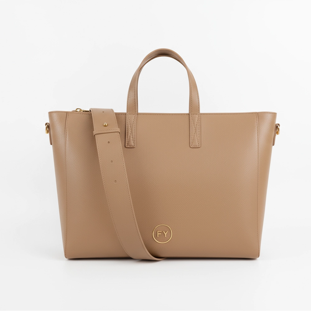
Here we shape the core impression of the handbag color or tote color in your collection.
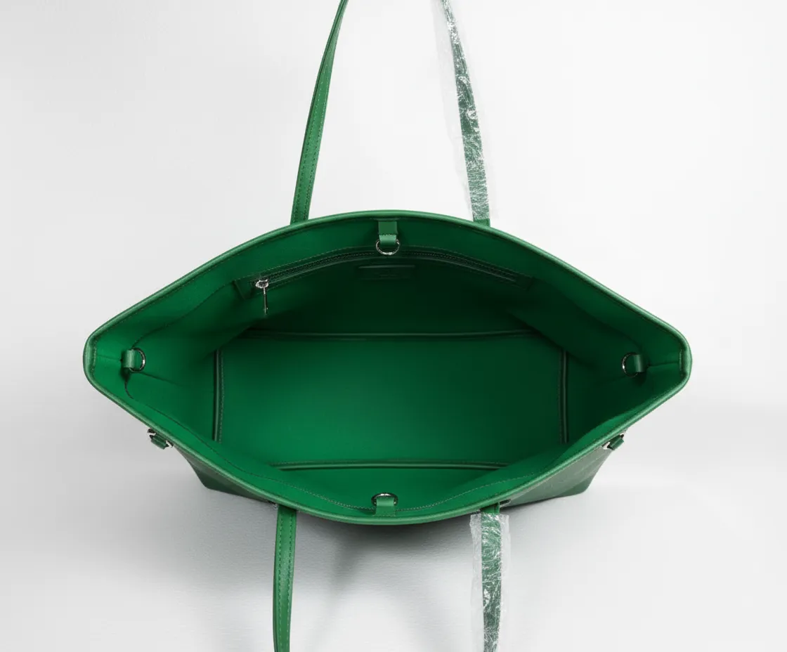
We propose lining logic by category, instead of forcing one lining color for every bag.
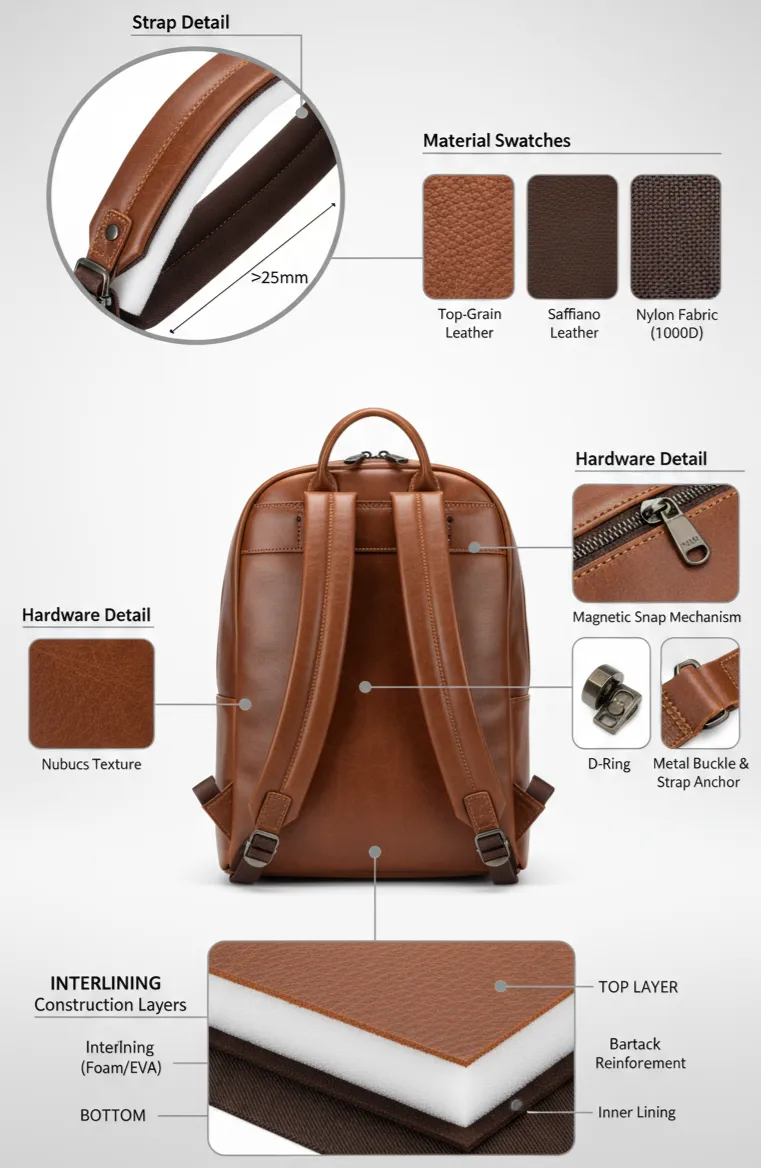
Especially for premium custom handbag colors, we pay special attention to edge paint and thread color harmony.
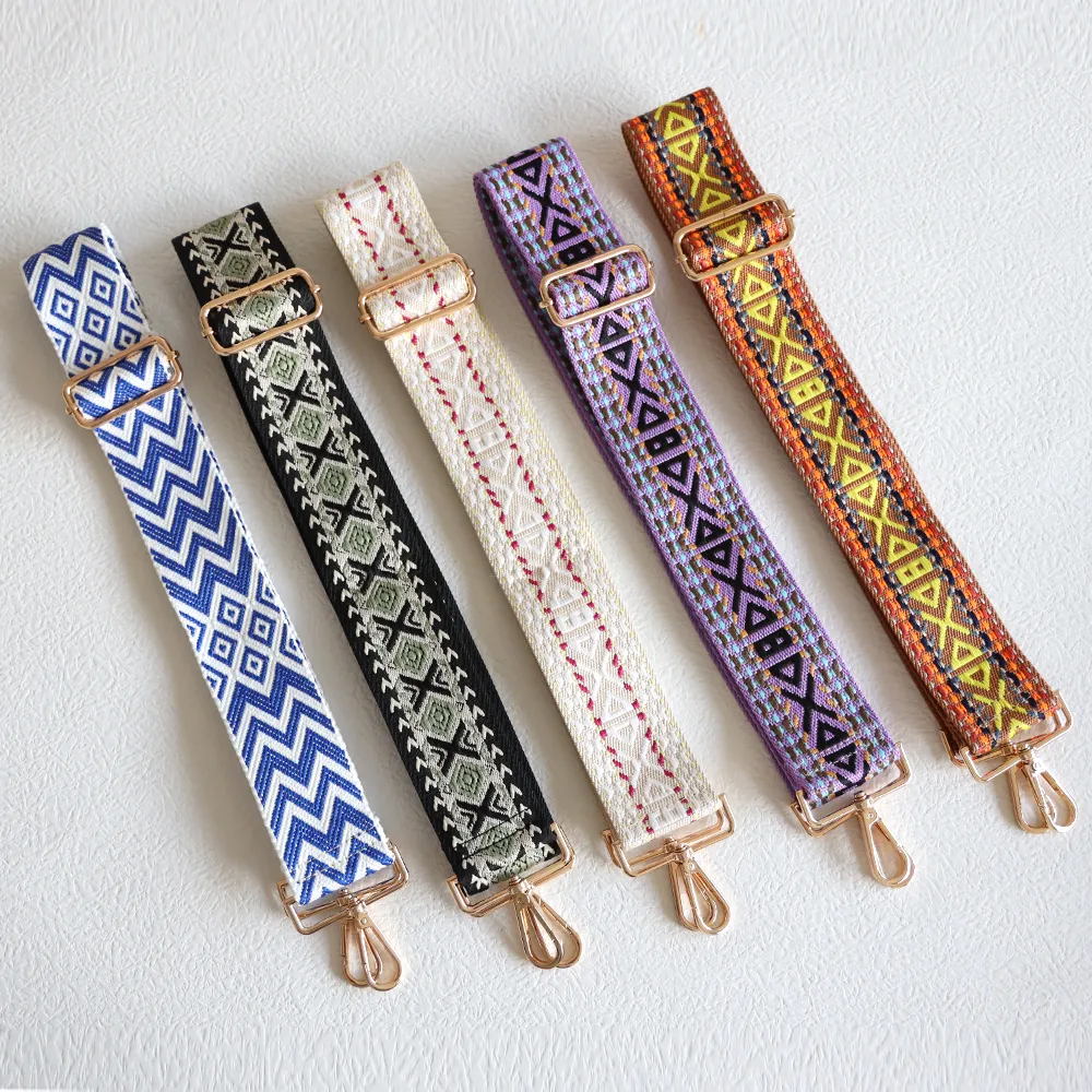
For B2B clients, this allows us to build multiple SKUs out of one pattern by carefully tuning color, without redesigning the bag structure.
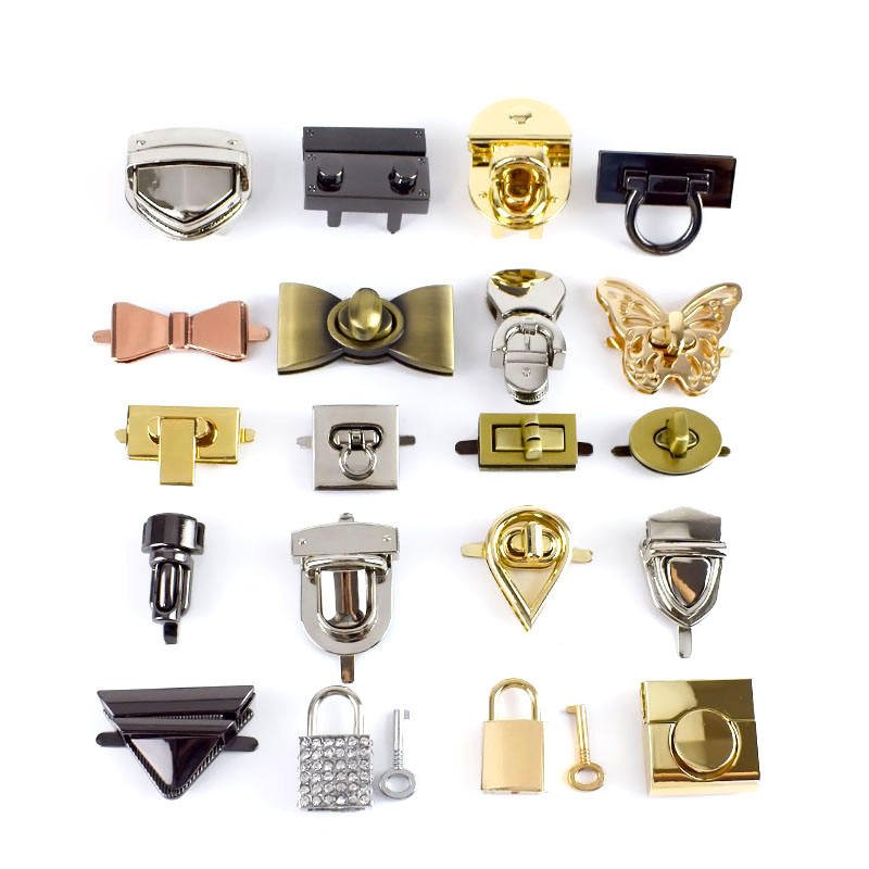
We integrate hardware finish choices directly into your custom bag color plan.
Whether you are designing a minimalist line in neutral tones or launching a bold seasonal campaign, our color engineering team is ready to bring your palette to life.
“Precision. Emotion. Consistency.” —- These are the three pillars of color at FYBagCustom.
Color is the most technically demanding customization dimension — the same Pantone reference looks different on nylon vs cotton vs PU leather, under warm vs cool lighting, on matte vs glossy finishes. Here’s the infrastructure that ensures your bag’s color matches your Pantone swatch — every time, every batch.
We use a structured workflow to move from brand palette to production-ready custom color bags.

You provide:
We deliver:

We convert your design preferences into color specifications that factories can execute:
The output is a Custom Bag Color Brief that is clear for both your design team and your manufacturing partners.

The real difficulty is matching one bag color across multiple materials. We develop:
We fine-tune color recipes and processes until the overall visual result matches your expectation, not just a number on a machine.

We produce sample bags to evaluate the real effect:
At this stage we often make final adjustments to key custom handbag colors or tote colors (slightly warmer, cooler, lighter or more muted).

Once you approve, we:
Your bag color palette becomes a long-term, reproducible system rather than a one-season guess.
For you, this means your custom bag colors are controlled, predictable and less likely to cause supply chain or after-sales issues.
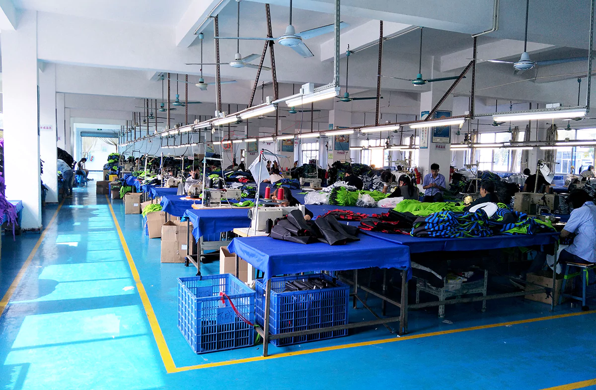
We can start by designing your color system, then build products around it.
Yes. We produce a lab dip (dye sample on actual fabric) for your Pantone reference. The lab dip is verified under D65 standard lighting and sent for your approval before the full roll is dyed. Adjustments are free. Some very dark or very bright Pantone shades may have limited achievability on certain natural fibers (jute, unbleached cotton) — we flag this at the lab-dip stage.
Three controls: (1) Source all fabric rolls from one dye batch. (2) Compare all incoming rolls side-by-side under D65 on arrival — flag shade variation. (3) During cutting, panels from different rolls are never mixed on the same bag. For multi-batch orders, ΔE ≤ 1.5 is the acceptance tolerance. We store the approved lab dip permanently so reorders match the original.
Yes — multi-material color coordination is standard. Same Pantone matched across shell fabric, hardware (plating), logo (ink or thread), lining, and packaging (box, hang tag, insert card). We photograph all components together under standard lighting for your approval before production begins.
Start with 2–4 neutrals (black, navy, grey, tan) as your core. Add 1–2 seasonal colors (pastels for spring, jewel tones for fall, bold for holiday). If you have a brand signature Pantone, include that across all SKUs. Total: 3–6 colorways per bag type is the sweet spot for most brands. More colors = more SKUs = higher inventory complexity.
The fabric’s original color — no dye applied. For cotton: natural ecru/off-white. For canvas: unbleached cream. For jute: natural tan. Undyed fabrics are the most eco-visible option — no chemical dyes, lowest environmental footprint. They also cost less than dyed fabrics (no dyeing step = lower per-meter cost).
Yes — and this is the most common source of color disappointment. The same Pantone dyed on nylon (shiny, smooth) vs canvas (matte, textured) will appear different in saturation and brightness. That’s why we produce lab dips on YOUR specific fabric, not on a generic swatch. If your bag uses multiple fabrics (e.g., nylon body + PU leather trim), we produce separate lab dips for each material and verify them side-by-side.
Stock colors (fabrics already in the supplier’s inventory in standard colors): 0 days added. Custom Pantone dyeing: 3–5 days for lab dip + your approval time + 7–14 days for roll dyeing. Total: 10–19 days. Stock colors are available for most neutrals (black, navy, grey, white) on popular fabrics. Custom Pantone is needed for brand-specific colors, pastels, and seasonal shades.
No. Screens use RGB light, while real bags use pigments and dyes on physical materials, so they will always look slightly different. This is why we strongly recommend working with:
We evaluate color under multiple light sources (daylight, warm indoor, store lighting) so the final custom color bag looks right in real life, not just on a monitor.
Yes. If you send us a physical sample (bag, fabric, leather swatch, packaging, etc.), we can:
This is often more accurate than working from photos, because lighting and editing can change how a color looks.
In many cases, yes—but the structure matters. Most OEM/ODM factories separate MOQ by design and color, so very small quantities in many different custom colors can become expensive.
A common B2B approach is:
Tell us your target quantities and market plans, and we’ll propose a test strategy that balances flexibility with realistic pricing.
Send us your Pantone references (or describe the colors you want), the fabric type, and the bag type. We’ll produce lab dips on actual fabric, verify under D65 lighting, and coordinate color across every component — shell, lining, hardware, logo, and packaging.