Tel/WhatsAapp:+86 13366396425
E-mail: chloe_xia@vleap.com.cn

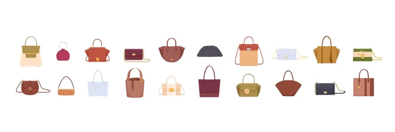
Who this guide is for: brand owners, product developers, and sourcing managers launching or repositioning a handbag line in the premium-minimalist space — the aesthetic defined by Totême, The Row, Polène, Mansur Gavriel, and the wave of logo-free, material-led brands that have captured the consumer who left logomania behind. If you want to understand why this aesthetic is uniquely demanding to manufacture — why every cost-saving default in bag production (contrast stitching, off-tone hardware, generic edge paint, thin lining) actively destroys the quiet luxury look — this guide is the production playbook: the specific construction choices that create “premium-feeling” without a logo.

Quiet luxury is the aesthetic that trusts the consumer to recognize quality without being told. There is no logo to signal the brand. No decorative hardware to catch the eye. No contrast stitching to announce the construction. The bag sits on a shelf — taupe leather, tonal edges, invisible closure — and it either feels expensive or it does not. There is no design layer between the consumer’s perception and the bag’s actual quality.
This is what makes quiet luxury the most technically demanding aesthetic in handbag manufacturing: every production shortcut is exposed. In a logo-heavy, hardware-decorated, contrast-stitched bag, a slightly off-tone edge paint is invisible among a dozen other visual elements. In a quiet luxury bag, the edge paint IS the most visible finishing detail on the entire product — because there is nothing else competing for attention. A slightly warm stitch on a cool-toned leather — a mismatch that would disappear on a bag with printed canvas and gold hardware — becomes the single element the consumer’s eye finds, and finds wrong.
The production playbook for quiet luxury is therefore not a list of premium upgrades. It is a discipline of tonal coherence and negative space — the systematic elimination of every visual, tactile, and acoustic element that does not serve the material-and-proportion story. What follows is the specification framework for manufacturing a bag that communicates premium through construction alone.
Before specifying construction, name what the consumer perceives — the visual and tactile cues that register as “quiet luxury” versus “standard commercial.”
| Signal | What the Consumer Perceives | What Creates It (Production Decision) |
|---|---|---|
| Tonal unity | Every element — leather, edge paint, stitching, hardware, lining visible at the opening — reads as one color family; nothing “pops” against anything else | Tonal-matched edge paint (ΔE ≤ 2.0 from body material); tonal-matched thread; tonal or recessed hardware; lining color in the same warmth family |
| Material primacy | The leather or material IS the design; its grain, its drape, its warmth dominate the sensory experience; “what is this made of?” is the consumer’s first thought | Premium-grade material (full-grain or high-quality top-grain) with minimal finishing; the material’s natural surface — grain, texture, subtle variation — is the aesthetic |
| Proportion confidence | The bag’s proportions feel “right” without decoration to distract; the height-to-width ratio, the handle drop, the gusset depth all create a silhouette that feels intentional | Precise pattern engineering; proportions refined through multiple rounds of sampling; generous (not cramped) dimensions |
| Absence of noise | No visual clutter — no excessive hardware, no decorative stitching, no contrast elements, no charms, no printed patterns; the eye rests | Minimal hardware specification; no decorative-only elements; every component serves a function |
| Finishing precision | The few details that do exist — the edge, the stitch line, the closure — are executed at the highest precision; because there are so few, each one must be perfect | Premium-tier edge finishing; 8+ SPI with tight consistency; precision hardware alignment |
Standard bag production has a set of defaults — choices that are made when the tech pack does not specify otherwise. These defaults are optimized for visual interest and cost efficiency, not for tonal restraint. Every default must be explicitly overridden for quiet luxury.
| Factory Default | Why It Exists | Why It Breaks Quiet Luxury | The Override |
|---|---|---|---|
| Contrast topstitching (white or cream thread on dark leather) | Visible stitching is a quality signal in commercial bags; contrast makes the stitch line pop | Contrast stitching introduces a second color that disrupts tonal unity — the stitching “announces itself” | Specify: “Tonal thread: ΔE ≤ 3.0 from body material. Thread must be visually indistinguishable from the leather at arm’s length under D65 light.” |
| Bright polished gold hardware | Gold hardware is the most universal “premium” signal in commercial bags | Polished gold screams — it catches light, draws the eye, and announces “look at my hardware”; it is the opposite of quiet | Specify: “Hardware finish: brushed matte, dark lacquer, or tonal-coated zinc alloy matching the body color family. No bright polish. No mirror finish.” |
| Branded lining in a contrast color | A branded, colorful lining signals a designed interior | A bright-red or electric-blue lining creates a jarring contrast when the bag is opened; the “surprise inside” breaks the restraint | Specify: “Lining: tonal — same warmth family as the exterior (warm exterior → warm lining; cool exterior → cool lining). No contrast lining. Branded jacquard acceptable if tonal (same color, texture-only pattern).” |
| Single-coat edge paint (off-white or generic brown) | The cheapest edge treatment; applied quickly; “close enough” to the leather color | An off-tone edge is the #1 visible defect on a quiet luxury bag; the eye goes straight to the edge because there is nothing else to look at | Specify: “Multi-coat edge paint, tonal-matched to the body material (ΔE ≤ 2.0). Beveled, sanded between coats, with satin clear coat.” |
| Visible exterior branding (logo plate, debossed logo, printed logo) | Branding identifies the product and builds brand recognition | Any exterior logo breaks the “no-logo” code; quiet luxury brands place their mark inside (on the lining label, on the interior leather patch) — never on the exterior face | Specify: “No exterior branding on any visible surface. Brand identification: interior label only (woven, leather patch, or subtle deboss inside the flap).” |
In quiet luxury, the material is the design. There is no pattern, no print, and no decoration to compensate for mediocre material — the leather or PU must carry the entire sensory experience alone.
| Material | Suitability | Why / Why Not |
|---|---|---|
| Full-grain leather (aniline or semi-aniline) | The gold standard — this is the material that defines the category | The natural grain is the aesthetic; the patina story is the brand narrative; the consumer touches the leather and feels the material’s quality directly, without coating or correction |
| Full-grain leather (light pigmented) | Very good — a thin pigment layer provides stain protection while retaining visible grain character | For brands targeting the “premium-accessible” tier where the consumer wants leather quality with slightly lower maintenance |
| High-quality top-grain (lightly corrected) | Acceptable — if the correction is minimal and the surface retains some natural grain character | Heavily corrected, embossed top-grain reads as “coated” to the trained eye; specify light correction only |
| Premium microfiber leather | Good — the luxury-vegan alternative; microfiber suede reads as “considered material choice” rather than “cheap substitute” | Must be presented as an intentional material decision (“our engineered microfiber”), not as a leather imitation |
| Garment-grade soft PU | Conditional — acceptable if the PU quality is high and the brand position is “modern minimalist” rather than “quiet luxury leather” | Standard PU reads as PU to the consumer who shops the quiet-luxury segment — she knows the difference; only the highest-grade PU works |
| Standard PU, heavily embossed | Does not work | The embossed pattern introduces a visual layer that competes with the quiet aesthetic; the PU surface does not develop patina; the material fails the “what is this made of?” test |
Quiet luxury lives in a narrow color band — the colors that let the material speak rather than the color:
| Color | Role | Production Notes |
|---|---|---|
| Warm taupe / greige | The hero color — the most quintessentially “quiet luxury” shade; neither brown nor gray, it is the color that says “I chose subtlety” | Requires precise lab-dip control — taupe is highly sensitive to warm/cool shifts; a warm taupe that drifts cool reads as “ash gray” (wrong); a cool taupe that drifts warm reads as “khaki” (wrong) |
| Cognac / warm tan | The heritage neutral — warm, rich, inviting; communicates “quality leather” without trying | The easiest warm neutral to produce; aligns with leather’s natural base |
| Black | The foundational dark — every quiet luxury collection needs black | Black in quiet luxury must be warm-neutral (not cool-blue); specify “warm black” or evaluate under 2700K to confirm |
| Espresso / chocolate | The alternative dark — richer and warmer than black; the 2026 “Cocoa Powder” trend color | Strong — dark brown reads as luxury leather; hides wear beautifully |
| Ivory / cream | The light neutral — aspirational, editorial, seasonal | Production-demanding (soiling, UV, substrate sensitivity) — see our Cloud Dancer production guide |
| Olive / moss | The understated color — the only “color” that reads as quiet luxury; olive is earthy enough to sit within the tonal-neutral palette | Achievable on leather and PU; the warm base enriches olive |
Colors that break quiet luxury: any bright, saturated, or neon color; any pastel lighter than cream; any metallic; any print or pattern. The moment a color demands attention, it contradicts the ethos.
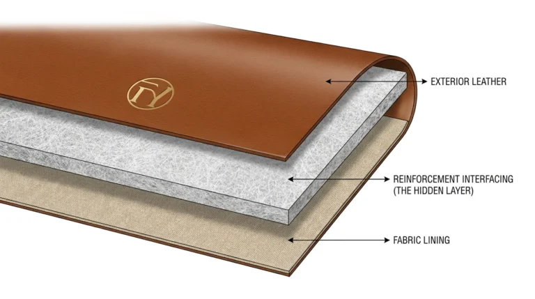
On a quiet luxury bag, the edge IS the most visible finishing detail. The consumer’s eye, with no logo or hardware to land on, scans the bag’s lines — and the edges define those lines.
| Element | Specification | Why |
|---|---|---|
| Treatment | Multi-coat painted edge (minimum 4-layer: sealer + 2 color + clear) with beveling and inter-coat sanding; OR hand-burnished natural edge (the luxury-house alternative) | The multi-coat system produces the smooth, rounded, tonal bead; the burnished natural edge is the heritage alternative — both communicate precision |
| Color | Tonal-matched to the body material — ΔE ≤ 2.0; the edge should be visually indistinguishable from the leather at arm’s length | Any color deviation — even 3–4 ΔE — is immediately visible on a quiet luxury bag because the edge is one of the ONLY visual details the eye evaluates |
| Sheen | Satin — the most common quiet luxury edge sheen; matte for the most restrained interpretation | Gloss edges catch light and “announce” themselves; satin reads as polished but quiet |
| Consistency | Every edge on the bag — handle, strap, flap, body panels, pockets — must be identically finished | One edge that is slightly darker, lighter, or rougher than the others breaks the tonal unity |
For brands at the true luxury tier, folded (turned) edges are the ultimate quiet luxury detail: no paint, no coating — the leather is skived, folded under, and stitched so the consumer only ever touches the leather’s face surface. The folded edge is invisible as a technique — it simply appears as though the material naturally continues around the edge. It is the most labor-intensive and the most “quiet” of all edge treatments.
Specify for: the top edge of the bag opening (the most-touched edge), the flap edge (the most-seen edge), and the strap edges (the highest-flex edges where paint cracking is most likely).
In quiet luxury, stitching should be felt (as structural security) but not seen (as a design element). The stitch line should blend into the material surface — visible only under close inspection, never from arm’s length.
| Element | Specification | Why |
|---|---|---|
| Thread color | Tonal — matched to the body material within ΔE ≤ 3.0; the thread should be the same hue and similar value (lightness) as the leather | Contrast stitching (the factory default) is the single most common quiet-luxury-breaking specification error; tonal stitching disappears into the material |
| Thread type | Bonded nylon, fine gauge (Tex 25–35) — thinner thread is less visible | Heavy thread (Tex 50+) creates a visible ridge; fine thread lies flatter and integrates |
| SPI | 8–10 SPI — dense enough that individual stitches are not easily distinguished | Lower SPI (5–6) creates visible, spaced stitches; higher SPI creates a near-continuous line that reads as a clean detail |
| Consistency | ±10% stitch length variation maximum; ±0.5 mm line straightness | On a quiet luxury bag where the stitch line is one of few visible details, any wobble or inconsistency is glaring |
| Topstitching presence | Minimize — topstitch only where structurally necessary (handle attachment, top edge, strap); no decorative topstitching | Every visible stitch line is a “statement” on a quiet luxury bag; the fewer statements, the quieter the luxury |
Quiet luxury hardware must be functional and invisible — the closure works, the D-rings hold, the zipper glides — but no hardware element draws the eye or catches the light.
| Element | Specification | Why |
|---|---|---|
| Finish | Brushed matte, satin, or tonal-coated (hardware plated and then lacquered in a color approximating the leather tone) | Polished gold or silver catches light from every angle — the definition of “loud”; brushed finishes absorb light and blend; tonal-coated hardware effectively disappears against the bag |
| Closure type | Hidden magnetic (concealed within the leather flap); or a minimal turn-lock in brushed finish; or a concealed zip (the zipper hidden behind a leather channel) | Visible, oversized closures announce themselves; hidden closures maintain the clean lines |
| Zipper | Metal teeth in a tone-on-tone finish (matching the body or the hardware); concealed zipper tape (the tape is hidden under a leather fold so only the slider is visible) | A visible zip line with contrast tape breaks the clean surface; a concealed zip preserves the unbroken leather plane |
| D-rings / strap hardware | Minimal size (20 mm maximum); brushed or matte finish; hidden where possible (inside a leather tab fold) | Large, bright D-rings draw the eye to the strap attachment — a point of visual “noise” |
| Base feet | Matching finish or eliminated entirely (use a leather base protector panel instead) | Bright metal base feet on the bottom of a quiet luxury bag create four points of visual interruption; leather or rubber base pads are invisible |
| Sound | All hardware damped per our silent hardware guide — magnetic closures with felt dampers, zippers with paraffin lubrication, no rattling D-rings | The quiet in “quiet luxury” extends to the acoustic experience; a bag that clinks and rattles contradicts the ethos |
The quiet luxury approach to branding: the logo is interior only.
| Location | Treatment | Visibility |
|---|---|---|
| Exterior | No logo — zero branding on any exterior surface | The consumer identifies the brand by material quality and silhouette, not by logo |
| Interior label | Woven label (tonal, small) or leather patch (debossed, tonal) sewn inside the bag — typically at the interior zip pocket or the back wall | Visible only when the bag is open; confirms the brand to the owner |
| Hidden stamp | A blind deboss (no foil, no color — just a pressed impression) on the interior flap or the interior base — visible only under angled light | The “secret” brand mark for the initiated; visible only to someone looking for it |
A quiet luxury bag opened to reveal a bright branded lining is a contradiction. The interior must be as restrained as the exterior.
| Element | Specification | Why |
|---|---|---|
| Material | Microfiber suede (the luxury default — soft, substantial, tonal) or cotton twill (for a warmer, more natural feel); avoid polyester taffeta (too thin, too “swishy”) and satin (too shiny) | The consumer reaches inside a quiet luxury bag and expects the interior to feel as considered as the exterior; taffeta fails this test |
| Color | Tonal — same warmth family as the exterior; slightly lighter or slightly warmer; never contrasting | The interior should feel like a continuation of the exterior, not a separate design |
| Pattern | None — or a tonal jacquard (the brand’s monogram woven as a texture-only pattern in the same color as the lining ground) | An all-over logo print in contrast color contradicts the no-logo exterior; a tonal jacquard adds perceived value without adding visual noise |
| Pockets | Minimal — one slip pocket, one zip pocket; clean topstitching; pocket edges folded or bound | Over-organized interiors (10 pockets, pen slots, key clips) read as “utilitarian”; quiet luxury interiors are simple, spacious, and considered |
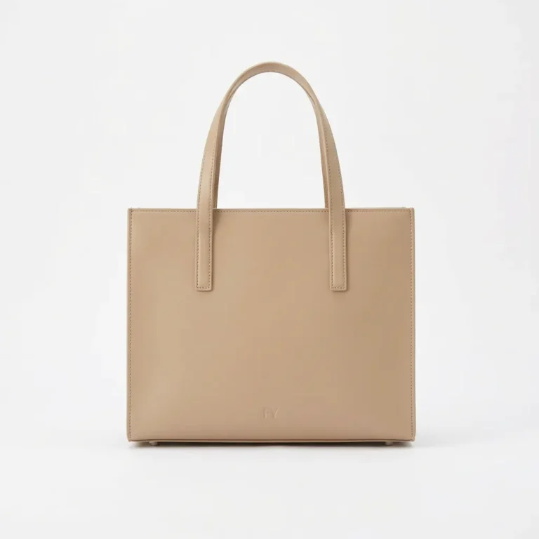
Quiet luxury bags tend toward generous proportions — they are not cramped minis or exaggerated oversized. The prototypical quiet luxury silhouette is a medium-to-large tote or shoulder bag with comfortable dimensions that suggest the owner has a full, real life — she carries a book, a laptop, a sweater — without the bag screaming “I’m carrying everything.”
| Silhouette | Quiet Luxury Version | Key Proportion |
|---|---|---|
| Structured tote | Generous midi (35–40 cm wide, 28–32 cm tall); flat base; clean top edge; dual handles with 22–26 cm drop (shoulder or hand carry) | Width-to-height ~1.2:1 — slightly wider than tall; stable proportions |
| Soft shoulder bag | Medium (30–36 cm wide); single strap; slightly slouchy but not collapsed; the material’s drape creates a natural, organic shape | Not too structured (architectural), not too soft (shapeless) — the middle ground |
| Crossbody | Medium (24–28 cm wide); clean flap or zip closure; adjustable strap in matching material | Proportions that read “adult” not “cute” — the crossbody must feel grown-up |
| Bucket bag / drawstring | Medium-tall (22–28 cm wide, 26–32 cm tall); drawstring in matching leather; clean base | The soft-structured middle ground that reads as effortless |
Standard QC tests (function, construction, durability) apply — but quiet luxury requires additional aesthetic QC tests that verify tonal coherence and restraint.
| Test | Method | What It Catches |
|---|---|---|
| The arm’s-length tonal scan | Hold the bag at arm’s length under D65 light; scan every element (leather, edges, stitching, hardware, visible lining); identify anything that “pops” — any element that draws the eye independently rather than blending into the whole | Off-tone stitching; mismatched edge paint; hardware that is too bright; a lining that flashes contrast color at the opening |
| The squint test | Squint at the bag so the details blur — the bag should read as one unified tone, one coherent shape; if you can see the stitch lines when squinting, the thread is too contrasty; if you can see the hardware, it is too bright | Thread and hardware that are close-but-not-close-enough to tonal |
| The silence test | Handle the bag normally for 30 seconds — open, close, lift, set down, adjust the strap; listen for any hardware sound | Rattling D-rings, clicking closures, grinding zippers — any acoustic “noise” |
| The material-first test | Show the bag to someone who has not seen the brand or the price; ask: “What is the first thing you notice?” The correct answer for quiet luxury: “the leather” (or “the material”). The wrong answer: “the stitching” / “the hardware” / “the logo” / “the lining color” | Any specification error that draws attention to a secondary element rather than the material |

FYBagCustom is Your Trusted Custom Bag Manufacturer in China, with 15+ years of manufacturing experience across every aesthetic — including the tonal discipline and finishing precision that quiet luxury demands. For brands developing logo-free, material-led collections, our capabilities include:
Contact our development team to discuss quiet luxury specifications, tonal matching, and recessed-hardware finishing for your collection.
The quiet luxury bag costs more to produce not because it uses more material or more hardware — it typically uses less of both. It costs more because it demands precision in every tonal match, consistency in every stitch, and discipline in every finishing decision. There is nowhere for imprecision to hide. For B2B buyers developing quiet luxury handbags, three core takeaways:
If your 2026 collection targets the premium-minimalist consumer who has left logos behind, contact FYBagCustom to discuss tonal matching, recessed hardware, full-grain sourcing, and the quiet luxury specification — and receive samples that pass the arm’s-length tonal scan, typically within 7–12 days.
FYBagCustom delivers quiet luxury precision — tonal edge matching, recessed matte hardware, concealed closures, fine-gauge tonal stitching, and interior-only branding — because this aesthetic has nowhere for imprecision to hide. Tonal-matched samples in 7–12 days.
Start Your Custom Bag Project →