Tel/WhatsAapp:+86 18011919834
E-mail: chloe.x@fybagcustom.com

Tel/WhatsAapp:+86 18011919834
E-mail: chloe.x@fybagcustom.com
Send Your Inquiry Today

Who this guide is for: brand owners and product developers building FW26 color stories for handbag lines. The season’s palette made a decisive turn: from spring’s poppy primaries to what NET-A-PORTER’s trend team describes as sophisticated bottle green, ochre, scarlet, and purple — the colors of the gothic-romantic mood that ran from Erdem and Simone Rocha in London through the velvet, lace, and brocade textures of the whole season — with chartreuse cutting through as the deliberate discord note. Rich, saturated, darkly emotional colors are a different production proposition from neutrals and pastels: they drift more between dye lots, they shift more between light sources, they rub off when the dyeing is wrong, and they expose every weakness in edge-paint matching. This guide translates each of the five FW26 colors into its production profile — dye behavior, metamerism risk, fastness requirements, edge and hardware pairing — and closes with the line-allocation logic that decides which colors carry volume and which carry the story. It complements our evergreen color-development guide, which covers the lab-dip system itself; this is the season-specific application.
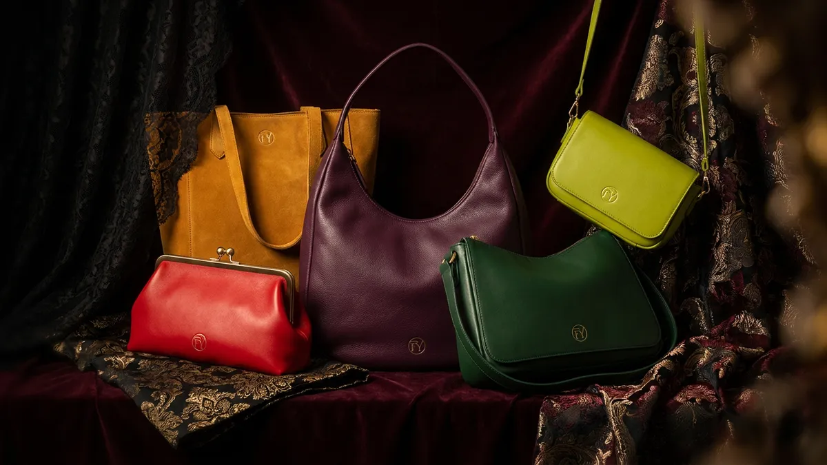
The FW26 color story has a mood before it has a swatch card. The season’s through-line — the darkly romantic, gothic glamour that began in London and, in PORTER’s phrase, became the thread that stitched the season together — expresses itself in colors that read as if mixed for an oil painting rather than a trend deck: bottle green against black lace, scarlet against velvet, deep purple in charmeuse, ochre across suede, and an acid chartreuse used, as the Paris color reports put it, as a deliberately unsettling flash of modernity against the grounded palette. NET-A-PORTER’s buying leadership confirmed the commercial read: chartreuse, deep red, and rich purple appearing consistently across collections, styled in tonal clashes and saturated blocks — with full black re-emerging as Milan’s power statement beneath it all.
For a production team, this palette is a specific technical assignment. Saturated, complex, darkness-adjacent colors are the hardest category in color manufacturing: they are built from multi-pigment recipes that drift between batches, they change character between daylight and restaurant light, their heavy dye loads raise rub-off risk, and their edges and hardware must be matched with more care than any neutral demands. A brand can approve a gorgeous bottle green lab dip in March and receive an olive-drab bulk in August — not through factory negligence but through the physics of complex color, unmanaged. The management is what this guide specifies, color by color.
Before the individual colors, the properties the whole family shares:
| Property | Why the FW26 Palette Has It | The Standing Control |
|---|---|---|
| Multi-pigment complexity | None of the five colors is a single-pigment hue; each is a recipe (blue+yellow greens, red+blue purples, shaded reds and yellows) — and recipes drift when any component varies | Physical Approved Lab Dip (ALD) on the production material, ΔE tolerance in the PO, spectrophotometer verification per roll at incoming inspection — the full system from our color-development guide, applied without shortcuts |
| Metamerism exposure | Complex recipes can match under one light source and split under another — the defining risk of this palette | Dual-illuminant approval as mandatory: every dip approved under D65 (daylight) AND a warm source (2700–3000K); the gothic-romantic palette will be worn in evening light, which is precisely where metameric pairs betray themselves |
| Heavy dye loads | Saturation means more colorant in and on the material — and more colorant available to rub off onto camel coats and cream knitwear | Crocking specification tightened for the season: dry rating 4 minimum, wet rating 3 minimum, tested per material lot — and raised to 4/3.5 on scarlet and deep purple (below) |
| Edge and trim matching burden | On saturated bodies, an off-shade edge paint or zipper tape reads immediately; tonal discipline is harder exactly where it matters most | Edge paint tonal-matched at ΔE ≤ 2.0 against the ALD (not against a color name), zipper tapes and threads dip-matched in the same cycle as the body material |
| Black as the palette’s anchor | Milan’s full-black statement is the palette’s silent sixth member — every color above pairs against black in the season’s styling | The black SKUs carry the volume floor and need the least color management; budget the color-engineering attention where the risk lives, on the five hues |
The deep, blue-leaning green of glass and hunting jackets — the palette’s most “investment piece” color and its most commercially proven dark alternative to black.
| Production Dimension | Profile |
|---|---|
| Recipe behavior | Deep greens are blue-plus-yellow constructions, and the balance point is delicate: a batch that drifts blue reads as teal-adjacent; a batch that drifts yellow reads as olive — two different bags from one color name. Drift risk: moderate-high |
| Metamerism | Significant — bottle green’s blue component recedes under warm light, pushing the color toward olive/forest in evening settings; the dual-illuminant approval must confirm the green stays green at 2700K, and the brand should decide deliberately which rendering is the “true” one |
| Fastness | Standard palette controls suffice: lightfastness 4+, crocking 4/3 |
| Materials | Outstanding on smooth and pebbled leather and PU (the glassy, saturated read), and the season’s natural on suede and velvet-texture panels, where the pile deepens the color; strong on croc-embossed gloss for the exotic-finish crossover |
| Edge + hardware | Tonal deep-green edges at ΔE ≤ 2.0 — achievable but specify against the ALD, since “dark green” edge paint stocks vary wildly; hardware: gold is the classic pairing (the heritage read), gunmetal for the modern one |
| Line role | The palette’s volume color — the dark neutral-adjacent that sells like a color and reorders like a black; correct on the hero shoulder bag and the structured tote |
The season’s deep, dramatic red — running from true scarlet through the wine and crimson register the Paris runways leaned into — and the palette’s highest-stakes color, because red is the shade consumers know by heart.
| Production Dimension | Profile |
|---|---|
| Recipe behavior | Reds are the classic “memory color”: the consumer carries an internal reference for red the way she does for no green or purple, so batch drift that would pass unnoticed in ochre gets caught by eye in scarlet. Drift risk: moderate, but perceived drift risk: the highest in the palette — tighten the ΔE tolerance to ≤ 1.5 on the body material |
| Fastness — the red-specific risk | Red dyes and pigments are the category’s historic crocking offenders: heavy red loads rub onto light clothing, and a scarlet bag that reddens a cream coat is a one-photo review disaster. Raise the spec: dry crocking 4 minimum, wet 3.5, tested per lot — and run the test against a white knit swatch, not just the standard cotton, because knitwear is what the bag will actually ride against all season |
| Metamerism | Moderate — scarlet holds its identity across illuminants better than green or purple, but blue-shaded crimsons can flatten toward brick under warm light; the dual check still applies |
| Materials | The velvet color of the season (Gaultier’s wine velvet was a Paris signature); spectacular on gloss and patent finishes for the evening register; on smooth PU and leather it is the frame-clutch color — the gothic-romantic evening piece |
| Edge + hardware | Tonal red edges are among the hardest matches in edge painting — saturated red edge paint shifts visibly with coat count; specify the coat count on the ALD approval and hold it. Hardware: gold for the romantic read, black for the gothic one |
| Line role | The emotional hero — one scarlet SKU per silhouette family, positioned as the season’s statement and the holiday gifting anchor (deep red is December’s color as well as the runway’s) |
The rich royal-to-plum purple that NET-A-PORTER flagged as one of the two colors appearing consistently across fashion month — and, in Pinterest’s data, the “Plum Noir” register with burgundy-brown undertones. Beautiful, current, and the most technically treacherous color in the entire FW26 story.
| Production Dimension | Profile |
|---|---|
| Recipe behavior | Purple is a red-plus-blue construction with no stable anchor pigment in most commercial recipes — the hue family with the highest batch-drift risk in color manufacturing. A dye lot that leans red delivers plum; a lot that leans blue delivers violet; both answer to “deep purple” on a PO that lacks an ALD |
| Metamerism — the defining problem | Purple is the textbook metameric hue: recipes that match perfectly under D65 can split dramatically under warm light, where purples famously collapse toward brown, grey, or muddy maroon. The dual-illuminant approval is not a formality here — it is the entire decision. Approve the dip only when it reads as purple under both sources, and expect to reject the first one or two dips that don’t |
| Fastness | Heavy-load purples share red’s crocking exposure: dry 4 / wet 3.5, per lot. Lightfastness deserves one extra note — some violet colorants fade asymmetrically (the red component outlasting the blue), shifting a displayed bag toward maroon over a season of window light; specify lightfastness 4+ and confirm on the actual recipe |
| Materials | Charmeuse-adjacent satin finishes and velvet textures are the runway’s purple carriers; on leather and PU, a slight sheen (semi-gloss) keeps the color alive — dead-matte deep purple reads flat and loses the register |
| Edge + hardware | The hardest tonal edge in the palette — purple edge paints are mixed to order and drift exactly like the body color; approve edge paint and body in the same dip cycle, side by side, under both illuminants. Hardware: gold reads regal, silver reads cool-modern; choose per brand and hold one finish |
| Line role | The fashion-credibility color — the SKU that signals the brand read the season correctly; produce it in confident but conservative depth (its drift and metamerism risk make it the palette’s most expensive color to get wrong at volume), and let a purple hobo or East-West piece carry it |
| The honest note | If the program can carry only three of the five colors, deep purple is the one to cut last on trend grounds and first on production-risk grounds — a tension the brand should resolve consciously, with the dual-illuminant dips in hand, rather than by default |
The earthy, deep golden yellow that Paris showed across suede outerwear and monochrome looks — the palette’s warmest color and, in production terms, its easiest.
| Production Dimension | Profile |
|---|---|
| Recipe behavior | Ochre lives in the iron-oxide and earth-pigment register — historically the most stable colorants in the industry. Drift risk: the lowest in the palette. Batch-to-batch consistency is achievable with routine controls |
| Metamerism | Low — earth tones hold their character across illuminants better than any other family here; ochre under restaurant light simply warms, pleasantly |
| Fastness | Excellent by nature: iron-oxide-family pigments carry strong lightfastness; standard 4/3 crocking applies as written |
| Materials | The suede color of the season — Paris showed ochre across supple suede, and the pile-plus-earth-tone combination is the palette’s most tactile pairing (with the suede care disciplines from our sourcing guides applying as always); equally strong on canvas and cotton for the casual register and on pebbled leather for the heritage one |
| Edge + hardware | Forgiving tonal edges (earth-tone edge paints are stable stock colors); hardware: antique brass is the natural partner — the ochre-plus-brass combination is the season’s Old Master still life |
| Line role | The volume accent — the color that bridges the fall neutrals (camel, chocolate, per the season’s styling) into the palette; the safe second-color buy behind bottle green, and the natural crossbody and tote color for the daily-carry customer entering the trend |
The acid green-yellow that the Paris reports called deliberately unsettling — a flash of modernity against the grounded palette — and that the styling consensus assigns a specific role: as Who What Wear’s coverage put it, chartreuse works best as a smaller accent, a bag among them.
| Production Dimension | Profile |
|---|---|
| Recipe behavior | High-visibility yellow-greens sit at the bright end of the pigment range, where two risks concentrate: lightfastness (bright yellow-green colorants are historically the fastest-fading family — a chartreuse bag in a shop window can dull visibly within a season) and migration (some bright colorants bleed into adjacent materials and pale linings over time) |
| The fastness spec | Lightfastness 4 minimum verified on the actual recipe (do not assume — test), and a migration test: the material sandwiched against white PU and white lining fabric under mild heat for 72 hours, checked for color transfer |
| Metamerism | Moderate and directional — chartreuse reads greener under daylight and yellower under warm light; acceptable if approved knowingly under both |
| Materials | Smooth PU and coated nylon carry the acid register cleanly; the color’s electricity dies in matte, textured finishes — keep the surface bright |
| Edge + hardware | Tonal chartreuse edges exist but contrast (black) edges suit the discord role and sidestep a difficult match; hardware: black or silver — gold fights the acid note |
| Line role | The accent, sized as one: a mini bag, a small crossbody, a pouch, a charm or strap accessory — small-format SKUs in modest quantities that deliver the season’s jolt on the product grid and in content, without betting volume on the palette’s riskiest fastness profile. The chartreuse mini next to the bottle green hero is the merchandising image of the season |
| Color | Line Role | Depth | Silhouettes | Risk Budget |
|---|---|---|---|---|
| Black (the anchor) | The volume floor beneath the palette | Deepest | Every core silhouette | Minimal — spend the attention elsewhere |
| Bottle green | The palette’s volume color | Deep | Hero shoulder bag, tote | Moderate — manage the blue/yellow drift |
| Ochre | The volume accent / neutral bridge | Medium-deep | Crossbody, tote, suede pieces | Low — the safe buy |
| Scarlet | The emotional hero + gifting anchor | Medium | Frame clutch, one core silhouette | Raised crocking spec; tightest ΔE |
| Deep purple | The fashion-credibility statement | Conservative | Hobo or East-West, one silhouette | The highest — dual-illuminant gate before commitment |
| Chartreuse | The discord accent | Small | Mini, pouch, accessory formats only | Fastness-tested, small-format-contained |
The single-cycle discipline: run all five colors (plus their edge paints, threads, and zip tapes) through one coordinated lab-dip cycle — approved together, under the same two light sources, against the same material articles — so the palette that ships is the palette that was designed: five colors that relate to each other the way the runway styling intends, in tonal clashes and saturated blocks, rather than five independent approximations that never met before the warehouse.
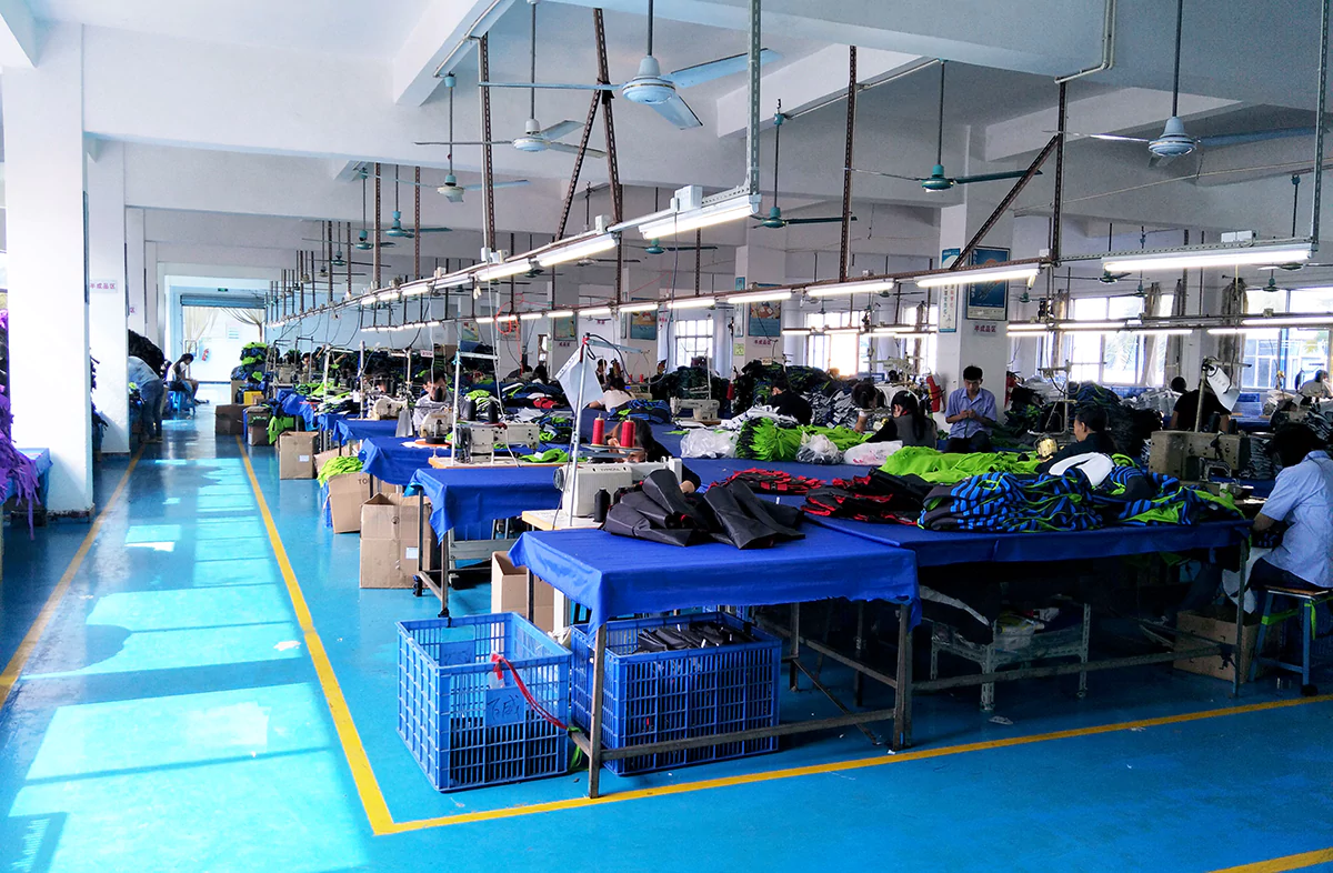
FYBagCustom is Your Trusted Custom Bag Manufacturer in China, with 15+ years of manufacturing experience and the color-management system this palette demands. For brands building FW26 color stories, our capabilities include:
Contact our development team to brief your FW26 palette — the dips, the tolerances, and the allocation.
The gothic-romantic palette rewards brands that treat saturated color as the engineering assignment it is. For B2B buyers building FW26 color stories, three core takeaways:
If you are building an FW26 color story and want the palette dipped under both lights, toleranced by hue, and allocated by risk, contact FYBagCustom to brief your program — and receive the five-color dip set, fastness reports attached, in 5–7 days.
FYBagCustom dips the full gothic-romantic palette under two lights, tightens the fastness specs where the dye loads demand it, and allocates production by each color’s real risk — so bottle green stays green, scarlet stays on the bag, and purple survives dinner. Five-color dip sets in 5–7 days.
Start Your Custom Bag Project →